Use
Printed matter and choice of paper
Södra produces a wide range of printed matter – from simple postcards and invitations to more elaborate brochures and reports. Our printed matter is mainly produced in-house, but also externally by our business partners.
To ensure a consistent and unified expression of the Södra brand, you should always follow the rules that have been established. These rules ensure that our layouts, images and formats are consistent. The goal is that all printed matter will convey a unified image of Södra. The rules can be found under Graphic identity > Design system – Grid. You can also download templates for InDesign here, with predefined paragraph style sheets.
Choice of paper
Paper choice has a huge effect on the feeling conveyed by print. Södra’s paper must also carry the FSC trademark – “The Mark of Responsible Forestry.” www.fsc.org. Södra uses a range of paper standards for its printed matter, both coated and uncoated, depending on the purpose of the product. See below.
Munken Polar The standard used for brochures, folders and member mailings. Munken Polar has a smooth uncoated surface and the distinctive bright-white finish enhances the brilliance of images, giving the material an exclusive and natural feel. Munken Polar is made by Arctic Paper. The text samples below can be used for printed matter. The paper is available with FSC™.
Scandia 2000 White Used for the Södran and Södrakontakt magazines. Scandia 2000 also has a matching range of envelopes. Scandia 2000 is Nordic Ecolabelled, FSC™-certified and made by the well-known company, Lessebo bruk. The text samples below can be used for printed matter.
Gmund Original Gmund Digital Vergé Creme is used for business cards and correspondence cards. Weight: business cards – 275 g, correspondence cards – 150 g.
Gmund can also be used for invitations or thank you cards, for example, to add a touch of style. Also comes with a matching range of envelopes.
Arctic Volume White and Arctic Silk+ High bulk, opacity and rigidity make this paper ideal for financial reports, posters and printed materials that require a little more durability. The paper is available with FSC™.
Recommended weights Covers 240-300 g, Inserts 130-150 g, Loose sheets and folders (4 pages), 170 g.
In order to mark our printed matter with the text samples below, our printers should be familiar with our requirements for using the FSC trademark. Please contact the Communication Department if you are unsure about what this means.
Text samples:
Graphic production: Södra Communication Department, DD MM YYYY. Photos: Södra’s image bank. Printed by “Tryckeri AB” on FSC-certified paper from Södra’s customer, Arctic Paper. Cover: Paper 000 g, insert: Paper 000 g.
Graphic production: Södra Communication Department, DD MM YYYY. Photos: Södra’s image bank. Printed by “Tryckeri AB” on FSC-certified paper from Södra’s customer, Arctic Paper, Munken Polar 130 g.
Signs
Södra has a concept for signs with various purposes. Consistency helps us to build recognition, and to promote One Södra.
We have divided signs into different categories
- outdoor/indoor directional signs
- business signs
- marketing communication signs
Outdoor/indoor directional signs
Directional signs are used for directional guidance, and to help people find their way to, and around, the facility. The sign must be clear. It may communicate specific, or general, information. The format of these signs should be clear and uncluttered. This category also includes guidance signs, welcome signs, etc.
Frutiger Roman and Frutiger Bold are used for the signage text. The basic principle is to create contrast between each level of text. Using point size and weight to create a visual hierarchy can be effective, for example:
- Combine bold and regular text without changing the point size
- Use different point sizes at header levels one and two, but keep the same weight
- Differentiate three header levels by using the same weight, but smaller point sizes.
Use signs in moderation and avoid directional signs if possible.
Business signs
Business signs are used to show the location of Södra’s business operations. Södra’s logo can be used as a standalone object on facades. Alternative 1: LED-illuminated standalone logo in green. Alternative 2: Unlit standalone logo in green that can be illuminated with spotlights.

More options are also available. Contact the Communication Department for advice.
Marketing communication signs
Marketing communication signs are used when Södra is promoting its products, services and operations externally (and sometimes internally). Examples include forest days, field trips to our facilities, trade fairs, customer events and training courses.
Please contact the Communication Department if you need a directional or business sign for your operations.
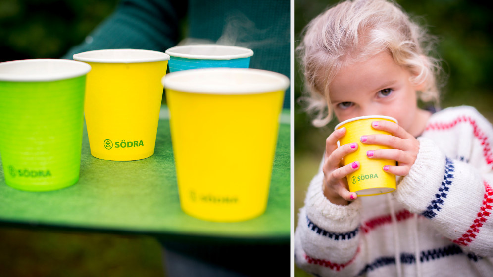
Promotional products
Brand-building promotional products
The aim of Södra’s promotional products is to make our Group more visible and thus better known. Promotional products can also be used as gifts. A carefully designed and targeted range of promotional products helps to strengthen the positive perception of our Group. Another goal is to strengthen the sense of belonging and pride among everyone who is, or has been, linked to our Group. This includes our owners, members, customers, employees, business partners and others. Proud wearers and users of our promotional products are important brand ambassadors.
Our promotional products should communicate:
- One Södra, one brand.
- A unified and cohesive forestry Group
Overriding criteria when selecting promotional products
Tips for ordering promotional products:
Always place your order well in advance.
Delivery times can sometimes be long.
Only order promotional products from our framework suppliers. Contact the Communication Department for information about existing agreements.
You can find Södra’s basic range of promotional products on the intranet.
Always request material samples and printed samples before ordering.
Always look at the samples in daylight.
Always ask whether combining orders is possible. Large volumes are nearly always cheaper than smaller volumes.
-
Always choose high-quality products, in terms of both durability and design
-
Choose eco-friendly products wherever possible
-
Choose products with a logical connection to Södra and our core activities
-
Choose the right promotional products for your target group (in terms of both product and price)
-
When choosing gifts, the product should always be suited to the personality and interests of the recipient. For information about the applicable threshold amounts for gifts to external recipients, refer to the guidelines for business-related entertainment on the intranet
-
Try to choose products that are unique to Södra, and that strengthen our image as innovative and accountable
-
Choose promotional products that feature the product’s own brand less prominently
-
Only order promotional products from our framework suppliers
The promotional products shown have been selected to illustrate the rules that apply for the development of promotional products. They are not recommendations for the types of promotional products that should be produced. We encourage creativity and innovation.
logo
-
Consider the following factors when producing promotional products with Södra’s logo:
-
The basic rule is that all promotional products must feature Södra’s logo (the symbol + Södra’s logotype).
-
Only use approved logo variants (refer to the rules under Graphic identity > Logo).
-
Avoid making the logo less than 4 mm high (symbol height).
-
If you cannot guarantee that the symbol will be clearly visible, a logotype may be used. In this case, “www.sodra.com” is written in lower-case letters in Frutiger 55 Roman.
-
If you are printing the logo on a structured material (such as canvas), the logo may need to be slightly larger than specified in the guidelines. Ask the supplier for advice and always request a printing sample.
-
Södra’s logo may only be printed in the colours of Södra Green, negative (white) and, in some cases, black (when colour is not an available option).
-
The free zone around the logo should always be at least as wide as the symbol.
-
Always place the logo horizontally. Do not place the logo on an angle or rotate it in any direction.
Typography
On promotional products/clothing, use Södra’s typeface as set out in the table below. The approved text colours are black and white (negative). Consider readability – do not use a point size (text size) that is too small. Using large point sizes on small products can make the text difficult to read, so you should always think carefully about the point size. Use the default typographic settings, see Typography under Graphic identity.

| Typeface | Style | Used for |
|---|---|---|
| Mercury Display | Roman eller Semibold, first letter capitalised | Headings or messages |
| Frutiger LT Std | LT Std Bold 65, uppercase or first letter capitalised | Sub-headings and text features |
| Frutiger LT Std | LT Std Bold 65, uppercase or first letter capitalised | Body text |
Colours

The basic rule is to avoid promotional products in black. Black is only permitted if the product needs be a darker colour for practical reasons, or if the product is not available in grey, for example. Typical products are various types of bags, backpacks and work clothes.
Finding products (such as clothing, bags, pens) with the right corporate colours may prove difficult. Avoid producing products with almost the right colour. Choose a white alternative instead. To ensure the exact reproduction of Södra’s corporate colours, printing or painting them on the material is recommended. Choose products in materials and colours that match Södra’s colour palette. The rules for using our colours (see Graphic identity > Colours) also apply to promotional products.
THE SYMBOL AND GRAPHIC ELEMENTS
Symbolen
Try to use the symbol when producing promotional products.
Please observe the following rules:
- The symbol is used on its own, and only on products with a suitable shape, such as pins, jewellery, cufflinks, etc. The symbol is then used as a decorative element.
- The symbol can be used in any of Södra’s corporate colours or white (negative). The symbol must not appear in red or black, but finishing techniques may be used.
Södra’s pattern
The positive-negative pattern should not be used if it clashes with other graphic elements, or on formats with a height of less than 50 mm. Refer to the guidelines for Södra’s symbol under Graphic identity > Graphic elements. The pattern is not suitable for small formats (>50 mm).
Pictograms
Pictograms are used to illustrate a context, clarify a feature or to promote a message in our communication. Choose pictograms on the basis of their purpose and message for the
promotional product’s intended target audience. If the pictogram only serves as a decorative element, use the symbol instead, see above.
Promotional clothing
The preferred colour of clothing is primarily white. For maximum readability and clarity, black text is recommended on white clothing and white text on dark garments. Our corporate colours may be used on vests, for example, to identify our representatives. All clothing must carry Södra’s logo. Place the logo on the left chest or left sleeve. The symbol can be placed on its own at the nape. See the sketches below.
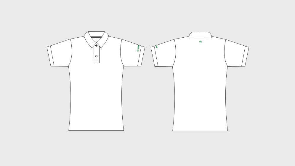
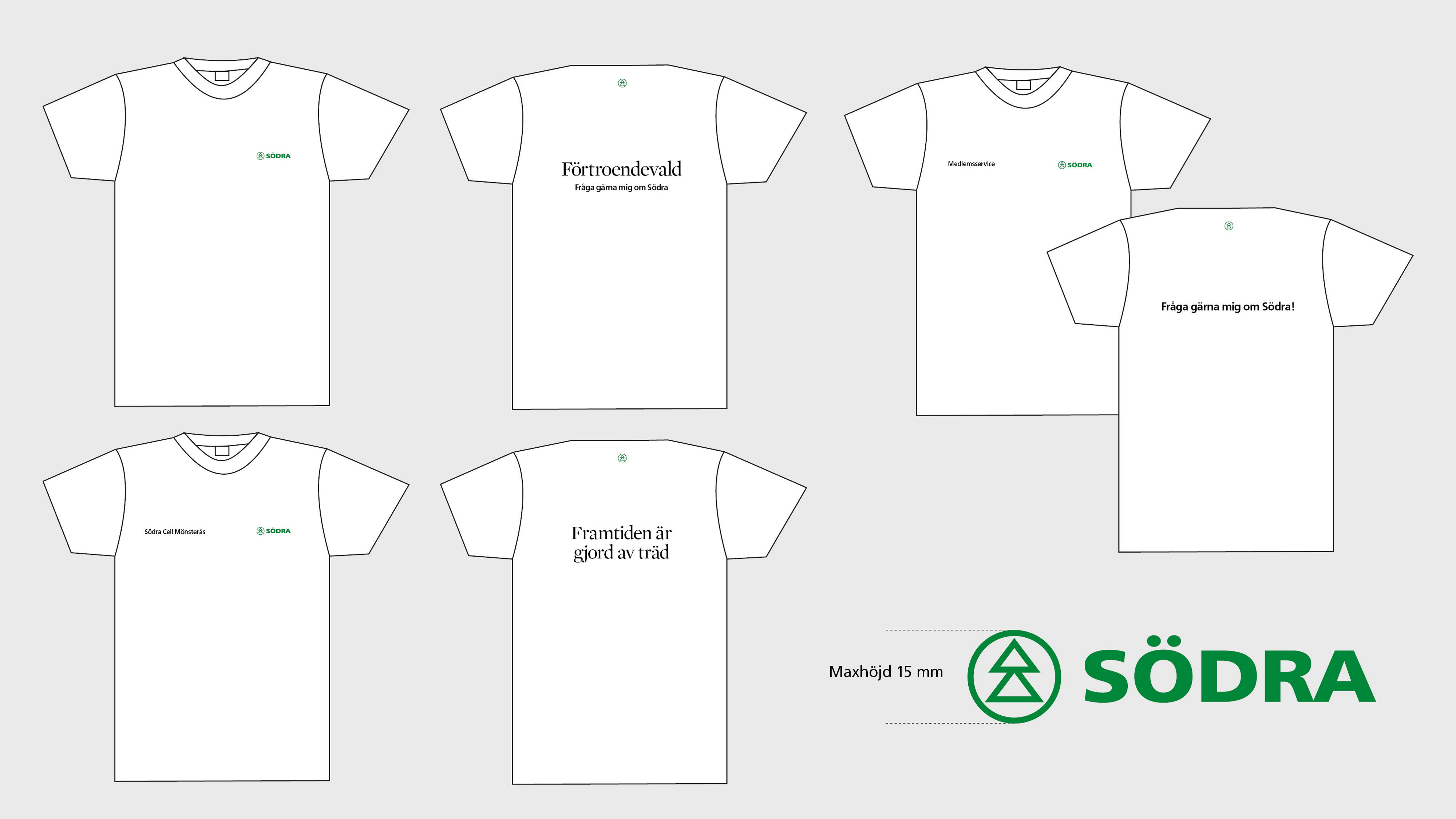
Examples of how the logo, text and symbol can be placed on a t-shirt.
Size and colour of the logo
The maximum height of the logo is 15 mm (symbol height), and the same applies for the symbol. On a dark background, use a Södra Green or white logo. Other rules apply for work clothes, see Work clothes.
Event flags

The logo and symbol are adapted for each unit and need. The flag can be made in an any corporate colour except red.
Flags
 Södra's flag
Södra’s flag is white with the Södra logo in the centre. The free zone around the logo also applies to flags.
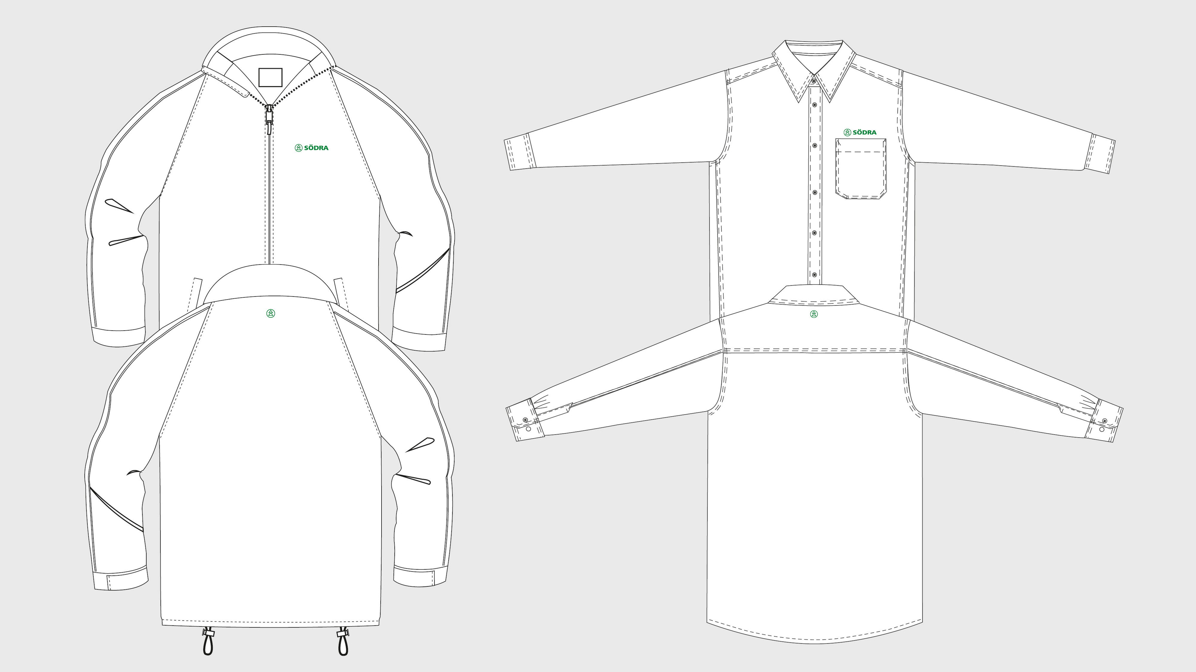
Work clothes
Södra’s logo must appear on our work clothes to show our affiliation. The full logo must always be used, and never be cropped or modified. The logo is available in two different colour versions, Södra Green or white. The Södra Green version is used on a light background, and the white version on a dark background. Always use the version with the highest contrast against your background. The size and placement of the logo depends on the type of garment.

SIZE AND PLACEMENT OF THE LOGO
Jackets, sweaters and vests
The logo is placed on the left chest. The size is 18 mm high. The logo can also be placed on the upper back. The size is 63 mm high.
If the garment already has a brand logo on the left side, place the logo on the front right to avoid competition with Södra’s logo. Any additional text is then placed under the logo, but outside the free zone (see the logo rules).
Trousers
The logo is placed on the right or left back pocket of the trousers. The logo can also be placed under the knee. The size is 18 mm high.
Helmet
The logo is placed in the centre on the front. Helmets should have a screen-printed logo. The size is 12 mm high.
Text placement and point size
If any other text is required on the clothing, such as the name of the business area or unit, it should preferably be applied to the right side of the garment to avoid competition with Södra’s logo. The text should be either black or white. Use the colour that contrasts best with the background. Always place the text in a straight line – not curved, or sloping in any direction.
 The name of the unit is written in uppercase Frutiger Roman, 26 points (about 7 mm). If the text is written on two lines, the text block should not be larger than the height of the logo, which is 18 mm. See the example above.
Partnerships
The name of the unit is written in uppercase Frutiger Roman, 26 points (about 7 mm). If the text is written on two lines, the text block should not be larger than the height of the logo, which is 18 mm. See the example above.
1. Choice of partners from a brand perspective
All co-branding should have the potential to strengthen Södra’s image. Before initiating a co-branding arrangement, consider the following:
- the co-branding should strengthen Södra’s image through association with the partner or activity.
- the co-branding should be relevant to our target audiences.
- there should be an action plan for implementation.
- the co-branding and areas of responsibility should be regulated by agreement.
2. partnership categories
The form of partnership must be identified before deciding how a co-branding arrangement should be handled.
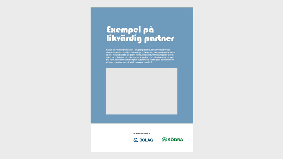
Södra as main brander As the main brander, Södra is the leading partner in the brand partnership. This is typically a project initiated by Södra, in which other parties participate. The main principle is that Södra, in these cases, is the partnership’s main brander. What this means, essentially, is that all of the partnership’s communication assumes Södra’s identity, with Södra’s logo as the sender. “Mixing” Södra’s identity with the brand elements of other parties is not permitted. In this type of communication, only the names and/or logos of the partners may be included. The communication is designed according to Södra’s current guidelines.
Södra as co-brander As co-brander, Södra appears beside two or more equal parties. In these cases, none of the partners’ visual identity elements are used in communication, which may lead to confusion and unclear images of who the sender is. In most cases, therefore, the communication of equal partnerships should be “neutral” in terms of visual expression, and not characterised by any partner’s identity. One alternative for long-term or permanent partnerships is to create a unique identity for the co-branding arrangement. However, the creation of a unique identity should be exercised with caution, since the identity will require maintenance.
Södra as partner of another main brander This type of partnership is led by another party, with Södra as a partner. In these contexts, the partnership should always be evaluated, particularly in regard to the potential branding risk, since Södra’s brand will appear in contexts beyond Södra’s control.
It is not permitted to use any of Södra’s other visual identity elements when another party is the sender. Södra’s name and/or logo may be used in co-branding arrangements led by other parties.
The use of Södra’s logo by other parties must always be regulated by agreements between the parties. Any use should be agreed on a case-by-case basis (which means that no general permission is granted for unrestricted use of the Södra brand over longer periods of time).
3. Appearance
It is important to ensure that the co-branding arrangement supports our visual identity. Consistent use of the visual identity guidelines creates clarity and makes the partnership easy to understand. The visual identity guidelines are divided into the three roles that we might play in the partnership: main brander, co-brander and partner.
Södra as a main brander
-
Södra’s visual identity guidelines are applied consistently
-
Södra’s logo should be placed in one of the top corners
-
The partnership is mainly expressed in text (Frutiger), which is placed in one of the bottom corner
-
A text must always be included to explain the relationship between us and our partners, such as: In partnership with...
There may be times when we use our partners’ logos instead of text. These are when:
- The partnership strengthens Södra’s image or creates added value for our target audience
- It is highly unlikely that the partner is associated with anything negative
- The partnership is relevant to our target audience
- The partnership logo is black or white, depending on the background, and Södra’s logo accounts for 70 percent
CO-brander
- No single party’s brand may appear more prominently, there may be several co-branders
- A neutral design is used consistently, i.e. no design elements from any one party are permitted
- Södra’s logo is used. Ensure compliance with the free zone guidelines, etc.
- In some cases, an explanatory text may be used, such as: A joint initiative by...
Södra as partner of another main brander
- The partner’s visual identity guidelines are applied consistently
- Only Södra’s name or logo is used
- Ensure compliance with the free zone guidelines, etc.
- Our logo is placed at a distance from the main brander, such as in different corners
- A text must always be included to explain the relationship between us and our partners, such as:
- In partnership with...
The may be times when we need to explain our partnership in text.
These are when:
- The partnership strengthens Södra’s image or creates added value for our target audience
- The partnership is considered a risk
- The partnership is not relevant to our target audience and creates confusion rather than clarity
Moving images
Moving images, such as videos, animations, etc. that are produced at Södra, must be based on our set of values: value-generating relationships and a long-term approach. Videos intended to educate and influence must be based on one or more of our brand values: accountability, innovation and precision.
Videos
Vignettes Vignettes must be consistent with our graphic identity. The vignette can have a coloured background, be transparent or white. The vignette must always be used at the end of a video. The vignette can be used at both the beginning and the end of a video, depending on what works best in the context. If you begin with a coloured background, use the same coloured background for the end. If you begin with a transparent background, end with a transparent or white background. The title of the video is written in Georgia Regular and left-aligned. Information text is written in uppercase Arial and preferably placed in the lower left corner.
Name signs Like the vignette, name signs are available in a range of styles and colours, in accordance with our graphic identity. Name signs can be both right and left-aligned. Uppercase Arial is used on name signs and any other signs used in a video, and the text must be left-aligned. Colours For plates and other coloured elements, Södra’s corporate colours are used: lime-green, blue or white. Web colours or red, green and blue values are used when choosing colours. Remember that videos often need to be compressed before they are published on the Internet, which could change the colours slightly. See the section on Colours under Graphic identity.
Thumbnails If you need to select a thumbnail for your video clip on YouTube, for example, choose a still that shows clearly what the image depicts, and is representative of the video. Do not use a still with the logo or vignette.
Graphics and animations
Pictograms in moving images Pictograms build recognition in Södra’s communication activities and are used to illustrate a context, clarify a feature or support a message. Pictograms should not be used as decorative elements – they must always serve a purpose, such as strengthening a context, or simplifying a message.
- The pictograms can use Södra’s corporate colours (except for red).
- Pictograms must never be used as a logo, or combined with Södra’s logo.
- Pictograms must not be filled with images or contain different colours.
- When using more than one pictogram, there must be enough distance between them to make each pictogram easily recognizable, and they must all be the same size.
- The pictograms should not be zoomed in/out, rotated or obscured by other graphic elements or text. The pictogram must not be filled with images or colour.
- Pictograms must not be combined to create new pictograms.
Animations Please contact Henrik Björnsson for more information, henrik.bjornsson@sodra.com
Music
Work in progress
Download video templates A template is used for subtitling, regardless of the intro, name sign or outro you choose. Follow the link below to download templates for Adobe Primiere Pro CC 2015.
All material published must comply with Södra’s graphic identity guidelines. Contact person: Henrik Björnsson, henrik.bjornsson@sodra.com
Web och digital
You can find guidelines for the use of graphic elements on websites and digital channels on the Södra Unity website – our web concept.